|
|
Post by Holyjoe on Jan 25, 2005 4:26:01 GMT -5
|
|
toohyper
Full Member
 Future Yeovil F.C Starting Left Back...LMAO Division 3!!!
Posts: 185
|
Post by toohyper on Jan 25, 2005 8:10:25 GMT -5
I like it...I really like the Samsung logo in the middle...Much better than the other crap they had before...And loving the stripes in the armpit area...
I think it's very neat looking kit..
|
|
|
|
Post by SteveW on Jan 25, 2005 12:33:47 GMT -5
Eeeeeeeee....not liking that. HATE the crappy Samsung logo in the middle - looks like its been stolen off a strip from the mid 90s. Whats that THING on the neck? A collar? Not any collar I've ever seen. Maybe be better in short sleeve version but looks pretty bad. Suwon should release a third RED strip. I'd buy that!  |
|
|
|
Post by IconsFanatic on Jan 25, 2005 12:51:11 GMT -5
I'd have to agree with SteveW... that kit is awful. Turqouise scales under the arms? Hows 80s. Neck is interesting, but not necessarily in a good way.... seems to be a variation of the neck Adidas currently use for their international kits (i.e. Greece, Canada, etc). And yeah, the Samsung logo needs a remake... "Hauzen" in Hangeul looked better.  |
|
Colombian
Full Member
"I PARK" said the valet when I drove up to the hotel..
Posts: 211
|
Post by Colombian on Jan 25, 2005 19:13:25 GMT -5
At least it's original, and not a copy of some european team's kit.
|
|
|
|
Post by Holyjoe on Jan 25, 2005 22:43:55 GMT -5
The blurb on the Suwon site said they tried to include the design styles from previous kits, especially around the late-90s/early-2000s when they were winning everything, hence the underarm scales...   |
|
|
|
Post by Holyjoe on Jan 25, 2005 22:51:05 GMT -5
|
|
mikey
Junior Member
Super Seoul
Posts: 67
|
Post by mikey on Jan 25, 2005 22:51:50 GMT -5
the first thing i thought when i saw this kit was greece euro 2004.
it is a kit that looks snazzy if you are a suwon fan but by next season will have aged terribly.
still it isn't copying a european team- is that a good or a bad thing??
|
|
|
|
Post by IconsFanatic on Jan 26, 2005 1:46:06 GMT -5
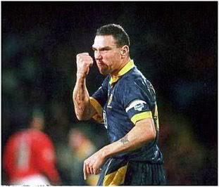
Song's facial expressions are priceless, especially the away kit photos. It just doesn't work when he tries to look tough. ;D
|
|
|
|
Post by svo7 on Jan 26, 2005 23:00:52 GMT -5
We should vote on this:
I say this is a lackadaisical bullshit attempt for their 10 year anniversary kit.
|
|